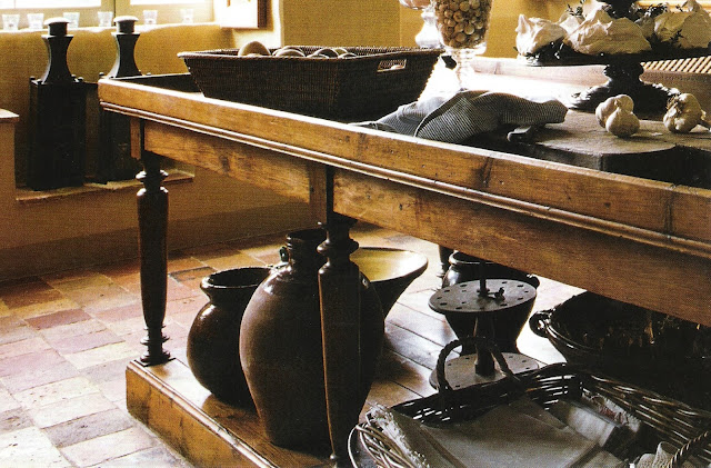
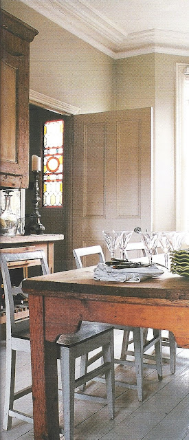
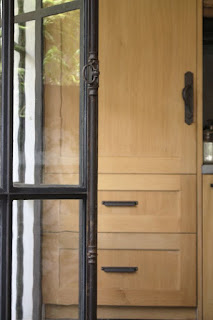
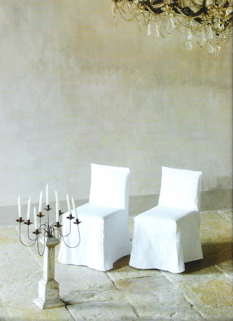
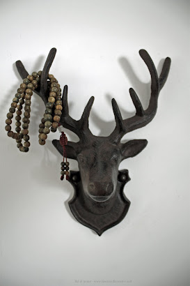
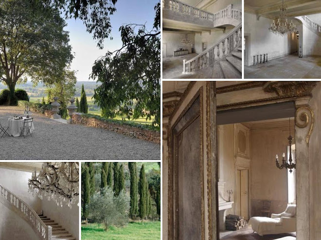
One common theme you will notice throughout the rooms featured on linen & lavender is that I gravitate towards neutral color schemes and rooms that often have unadorned walls, -save for beautiful light fixtures or the beauty of the stone or plaster finish. I prefer very subtle pattern (if any), opting for tone-on-tone more often than many colors, particularly for the fixed or main features of the design.
I love the contrast of, say, a gleaming industrial pendant juxtaposed with an ancient stone wall or a bejeweled chandelier hung over an antique farm table as the drama in the space. Accent colors and additional textures are infused into the room by the use of natural elements such as flowers and plants and things I use every day like a dark wood bowl of sunny lemons or a glass vase filled with lush, aromatic basil sitting on the counter.
It occurred to me that I prefer a neutral home environment for the same reason a chef prefers a white plate. . . the better to showcase the colors and textures of his creations. For me, the calming neutral rooms and unadorned walls act as a beautiful backdrop to showcase the people living there and to highlight the essential elements of life that will ultimately add vibrancy to that space.
I think a basic but powerful question to ask in design is:
Have I left room for living?
Have I left room for living?
This may seem overly simplistic, but it is an interesting concept to think about:
When you step back to assess a room or area of your home, you are not seeing yourself as part of the picture. -And, most likely, we've shooed out anyone else who may have been there, too!
Usually, when we analyze a space and try to determine whether we have "enough" in the space, we are referring to the furniture placement, the artwork and all the other objects that make up a room's decor. However, in order to get an accurate picture of the room as a whole, we need to envision the inhabitants there, as well.
Not only do we interject our physical presence -including the way we look and the clothes we wear- but we also impart our personality and energy each time we enter a room. All of this is sensed by us and "takes up space" in the room -whether we are aware of it on a conscious level or not- adding to how we perceive the room and how we feel there.
In art and design, we refer to negative and positive space. In a room, on a wall, in the pattern of a fabric, the negative space refers to the blank areas and the positive to the filled/occupied areas. So assess a room this way and ask yourself:
Have I left enough room in my design for the expression of the people living here? Will they feel uplifted and inspired in this space or overwhelmed and secondary to the "design" in the space?
-In other words. . .
Is there enough negative space for a positive experience?!
Editing is key in a successful design and once you remember to visualize the people in the space and all the items essential for their well-being, you may realize that you don't need to purchase as many purely "decorative" objects as you originally thought.
What is wonderful about this is that many of the items essential in day-to-day living (necessities you already buy) can be as beautiful as they are serviceable—functioning as the art and accents in the room. Not only is this a boon to your budget; it generates a life well-lived, every day.
What is wonderful about this is that many of the items essential in day-to-day living (necessities you already buy) can be as beautiful as they are serviceable—functioning as the art and accents in the room. Not only is this a boon to your budget; it generates a life well-lived, every day.
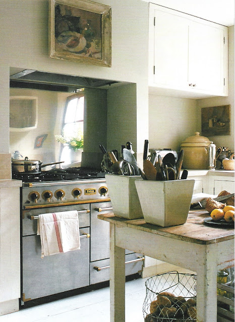
The kitchen, the heart of the home for most of us, has many opportunities for this. There is an amazing selection of color and texture in the array of fruits, vegetables and herbs available to us- items you most likely have on your grocery list already. All it takes is a little thoughtful planning to store and display them artfully until you are ready to use them.
For instance, I frequently buy bright green Granny Smith apples and display them in a large glass vase or tray on my kitchen table. . .What could be more simple yet add so much color and sculptural interest? The added benefit is that the display evokes thoughts of health and well-being and an unspoken reminder for a nutritious snack. Of course, they could be used anywhere, not just relegated to the kitchen only.
Apples, grapes, oranges. . . in a guest room or on an entry table are a cheerful, welcoming gesture.
Some of my favorite rooms may seem a bit austere to some -and I agree that many times a room in a magazine in set-up for artistic purposes more than actual living - by now, you know that I'm seeing those unadorned walls as a beautiful backdrop to the essential elements of life that will ultimately be part of the whole. . .
I see the plants, flowers, food, books, friends, family, pets -
all the interest and vibrancy of life lived well.
To clarify, I very much appreciate art and I have several pieces in my home, but I always leave more walls bare than not.
It seems to be a common concern of many to "finish" a space as quickly as possible.
How often have we heard -(or found ourselves saying),
"I need to find something for that wall."
- lamenting as thought it is the worst situation possible; a problem and something to be taken care of at the earliest opportunity.
When we think this way (in our haste to "fill a space"), we often settle for something "just to get by" or to "get the task accomplished" rather than something we've taken time to discover, something that brings us joy to have in our home and enriches our life in some way.
Here I suggest something radical to many: That you not only wait to find something you really love. . .you consider the value of the blank wall remaining just as it is.
Those blank walls and uncluttered, pared-down spaces in our homes hold a valuable bit of respite for us -if we allow them to do their job(!). . .
So grab an apple and sit a spell with your unadorned wall.
You may very well find what you really needed has been in front of you all along.
l&l at home -our kitchen- on pinterest:
Photo credits:
1 and 2, Cote Maison; 3-Cote Ouest, Avr-Mai2006; 4-Cote Sud, Dec03-Jan04; 5-Cote Maisons; 6-Cote Sud, Dec03-Jan04; 7-8-Cote Maison; 9-lb photo; 10-Cote Est, Juin-Aout 2002; 11-Cote Sud, Fev-Mar2005; 12-Cote Est, Juin-Aout 2002; 13-Cote Sud, Fev-Mars 200514-Cote Est, Sept-Nov 2001; 15-Cote Ouest, Aout-Sept 2005; 16-Cote Ouest, Aout-Sept 2003; 17-18 Cote Sud, Dec01-0Jan02; 19-20 Maison Madame Figaro, Oct 2001; 21-Cote Ouest, Avr-Mai 2006; 22-26, Cote Sud, unknown; 27-Marie Claire Maison, Mai-Jun 2005; 28-unknown; 29-Cote Ouest, Fev-Mars 2003; 30-Cote Sud, unknown; 31-Cote Sud, Avr-Mai 2001; 32-33-Cote Sud Aout-Sept 2007; 34-Cote Ouest, Oct-Nov 2005; 35-Cote Ouest Fev-Mars 2003; 36-Cote Ouest, Fev-Mars 2001; 37-Cote Ouest, Fev-Mar 2001; 38-Marie Claire Maison Fev-Mars 2006; 39-unknown; 40-Cote Sud, Fev-Mar 2003; l&l at home - kitchen design by LeAnn.
(us) ~ (fr) ~ (uk) ~ (ca) ~ (de) ~ (it)
see our new site:


